Wednesday, November 19, 2014

Module #8

Reading Assignment: Chapters 18,19 & 20

The International Typographic Style, The New York School & Corporate Identity and Visual Systems


During this week's reading I became interested by Michael Salisbury. There was something familiar about his name and his work for Rolling Stone that got me thinking I knew his work. After five minutes of research I realized this guy was a part of everything. Literally everything. He's one of the most iconic branding masters ever. Just looking at his client list you already know the guy is a big deal. He's the reason Michael Jackson wore one white glove, he was the one who suggested to put Paris in L'Oreal, he helped create the 'The City of Entertainment' branding for MGM Grand, he's done branding for the popular video game Halo and has received a Grammy for his work on an album design. Grammy! It's ridiculous how many things he's been a part of. These achievements are only a fraction of what he's done. Salisbury has created the highest earning re-branding in American business history.

Companies that Salisbury has worked for.
One of my favorite projects of Salisbury's is the branding of Michael Jackson's solo career. After seeing Jackson in the movie, The Wiz, Salisbury contacted Jackson's agent to immediately work with him. Salisbury felt Jackson had everything it takes to be a big star and was anxious to work on anything with him. After looking at some album cover mock ups that looked cheap Salisbury decided to take on the project and had some ideas. Salisbury believed Jackson needed to be presented as a big artist. He felt that fashion would help elevate Jackson to a higher level. So he decided to put him into a tuxedo that would scream "big deal" all over it. 

The agent hemmed and hawed and was just about to dismiss the whole nutty idea when a little, high-pitched voice softly squeaked, “I like it,” and Michael stepped out from behind the drape covering the large office window. "Let's just do it," he said.

So we did.

After the first photo shoot at Griffith Observatory at the Hollywood Planetarium was a bust. 


he genius behind Michael Jackson’s iconic image in black pants, glittery socks, and loafers wearing a single white glove.


Q: What else did you do to create the look that has become engrained in our popular culture?

Salisbury: My wife at the time found an Yves St. Laurent woman’s tux in Beverly Hills that fit Michael. I also told him to get loafers like Gene Kelly wore in An American in Paris. When we went to shoot the photo, I instructed him, “Roll up your pant legs, put your fingers in your pockets and pull your pants up like Gene Kelly—to show off the socks.” The loafers really made the white socks work. By the way, the socks were custom-made for Michael by famous Hollywood costume designer Bob Mackie.


Here, (left) is my first attempt at the photo for the cover of his solo album. After reviewing it, I thought that it didn’t show the real Michael. We were rushed and Michael was just not that into it. I thought he was a little too serious. We needed to shoot this differently. I mean, this album cover was just for him, not him and four other brothers.

I suggested we re-shoot it and when we did, I directed him to be more animated. I suggested he smile and exaggerate the pulling up of his pants and get into it like he was dancing. He was a great sport and agreed to do the re-shoot. We did the second photo shoot against a wall and voilá—“Off the Wall." (Below)


Q: Did you also suggest Michael wear a white glove?

SalisburyThe white socks were so successful in drawing attention to Michael and his dance moves, there was a conversation about doing gloves, too. White gloves. To me, I felt that would start looking literally Mickey Mouse (and of course Michael was a big Mickey Mouse fan). Between the agent and Michael and me, we got it down to one white glitzy glove. Another great move for attention.


Ed Ruscha's painting for West magazine
While working as art director for West magazine (1967-1972) Salisbury commissioned Ed Ruscha to create a cover for the magazine. The cover has the appearance of spilled liquids that form into words.

“My only direction to Ruscha was to use the word west,” recalls Salisbury, who owned the oil after the artist presented it to him as a gift.  “A lot of our covers symbolized the west.  This had the sun going down in a blue sky and the letters forming the word West emerging from the ocean.  It is one of the few pieces of editorial advertising, commercial graphic art that is considered fine art, which is quite an accomplishment,” notes Salisbury.

Ruscha's cover recently sold for over $600,000 in 2009 at Christie’s Post War and Contemporary Art auction at Rockefeller Center in New York. This piece is considered one of the most expensive editorial or advertisement sold as fine art. 

For more information check out Salisbury's official blog: http://www.onehellofaneye.com/

Tuesday, November 4, 2014

Module #6

Reading Assignment: Chapters 13,14 & 15

The Influence of Modern Art, Pictorial Modernism & A New Language of Form


This week's reading really reminded me of the Nazi Party. I'm slightly obsessed with WWII and Nazi Propaganda. It's just so mind boggling how a group of individuals brainwashed people into thinking genocide was a great idea! So ridiculous. I also know it's a little weird to be obsessed or interested in this topic since millions of Jews were murdered but it's history and I kinda love it. Not the murder part though. The fact that an artist like Ludwig Hohlwein could tarnish his reputation by just being associated with the Nazi Party and Hitler is impressive. His work was brilliant but used in the wrong way. I've researched this topic so many times and each and every time I'm always amazed how simple propaganda could work so well. Joseph Goebbels, Reich Minister of Propaganda, didn't create the art behind the posters so much as gave speeches that spread the party's ideas. He did have a great eye for what to look for and put together a great strategy to address the public. I've read that he was quite "obsessed" with Hitler and was in love with him. Weird. Also, he was on the shorter side so he would always wear taller headpieces or gear to give him height at large gatherings. Small man syndrome was clearly in effect here. But all jokes aside here is a little mini lesson on Nazi Propaganda. Enjoy!

The mastermind behind all things propaganda would be the loyal Goebbels who stayed by Hitler’s side till death. Being one of Hitler’s most trusted allies Goebbels had a great eye for propaganda to make it look easy and really acceptable. The trick would be to make the Jews less than human by stripping away all their human rights and dehumanizing them. “The growing distance – social, economic, legal and psychological – between Jew and Gentile helps explain how the Nazis could ‘remove’ a community virtually without protest from the rest of the population – a population which gradually felt, and was gradually persuaded, that it had precious little in common with the unfortunate Jews. The problem ‘they’ (the Jews) faces could be shrugged off as remote, as happening ‘somewhere else’, as ‘nothing to do with us’” (Landau 119). Goebbels position as Reich Minister of Propaganda seemed even more important in Hitler’s rise to power. One of his major accomplishments was screening the public on what they really needed. Now in a sense it could be seen as ineffective because the Nazis made so many rules that when they went out to poll people they could easily throw you behind bars if you did not agree with what they were saying. So all the information was skewed into what the party wanted to hear. Not saying that a lot of people didn’t believe in Hitler but it was wiser to go with the party’s ideas than to stray from the group. By getting a sense of what the people wanted Goebbels’ demands were easier to sell. Listening to the public was the golden ticket and Goebbels intended to maintain control of the public through his advertisements. After all how could a person not be for their wonderful fatherland of Germany, It would be so traitorous of them.

Joseph Goebbels
August 25, 1934

What made the Nazi Party so powerful was their ability to break down Germany’s perspective of Jewish people. Goebbels made it clear to the people that a Jew free world was needed. In a sense the propaganda had a way of desensitizing the Germans to the idea of Jews. Hitler believed that his superior “Aryan” race would prevail and the effective way of instilling his idea would be the proper propaganda campaign. “Hitler saw propaganda as a vehicle of political salesmanship in a mass market; he argued that the consumers of propaganda were the masses and not the intellectuals,” (Welch 11). By targeting large groups the use of propaganda made it easier to accept. If everyone had the same idea of the new Germany than less people would question it. Almost like the bandwagon theory, everyone jumps on and you would look dumb if you didn’t hop on. Sooner or later everyone would jump on the Nazi train to a “new and improved” Germany. Hitler believed that “propaganda for the masses had to be simple, it had to concentrate on as few points as possible, which then had to be repeated many times, with emphasis on such emotional elements as love and hatred,” (Welch 11). He believed that persistence was the most important requirement for success. If he could repeatedly program every German to believe what he thought was right then no one would fight against him. His dictatorship grew strongholds in the German government, as he became the face of the new German society that cared about the people and was for the people.

“Youth Serves the Führer. All 10-year-olds into the Hitler Youth.” (1940)
Membership in the Hitler Youth had become mandatory in 1936.

In the documentary film The Third Reich they discuss children being part of the campaign and how they knew what was going on. The children would create games where some would be Nazis and some would be Communists. They used garbage cans as the headquarters and as the game went on the Communists would get captured and sent to concentration camps. The children even knew which songs to sing and what would happen to the “bad” people. Attack and triumph would be the motto, just like the real Nazis. The children even learned their first mandatory German greeting: Heil Hitler!

Propaganda films also started to focus on the unwanted Jewish genes. They produced movies that showed mental hospitals where people looked insane and unclean. They told lies of the people having dysfunctional genes that were not German pure blood. The films made it seem like these people were the result of a bad mixture of blood. They wanted to show Germans that if the public continued to mix with Jews that it would result in bad blood. The films were effective in convincing people to stay away from the Jews. The public complied to the new laws of not mixing blood with other races or Jews. The Germans would sterilize anyone who had a genetic flaw. At least 400,000 Germans were sterilized for blindness, mental depression, alcoholism, homosexuality, deafness, physical deformity, sexual promiscuity or epilepsy. 

Hans Schweitzer 1934/1944
Translation: "The Jew: The inciter of war, the prolonger of war.”

What made the propaganda of the Third Reich so powerful was the ability to defeat all competition. The Nazi party became so powerful that opposition would only mean death. The ability to create a strong national power was in fact Hitler’s greatest triumph. He had little resistance, he had Goebbels brainwashing the public to think what they were doing was perfectly legal and had the perfect timing to become a savior to the people and guide them to a new Germany, a Germany they could be proud of. Ultimately it was Hitler’s idea to issue the Jewish death warrant. “The extermination of the Jews did not figure among the original Nazi aims,” (Poliakov 110). The moment to move ahead with plans came when the party realized they had gone too deep and couldn’t turn back. They invested everything that they had and knew that the war coming would not end quickly. The Nazi power was at its peak and the gamble to burn all the bridges tying the public to Jews was the next step. Goebbels even mentioned in his diary that the “Jewish problem was so entangled it was impossible to retreat” (Poliakov 110) and plans must progress forward. Goebbels was a huge fan for the extermination of the Jews. In his world it seemed right to due away with the vermin of the Jews. It was only a matter of time until the world caught up with the Nazis. Unfortunately they were able to kill six million before anything was done. The power of the propaganda to brainwash an entire nation was powerful. Hitler became one of the most hated dictators in the world yet loved by so many Germans who just wanted a simpler life.

Sources:
  • Landau, Ronnie S. The Nazi Holocaust. Chicago: I.R. Dee, 1994. Print. 
  • Poliakov, Léon. Harvest of Hate: The Nazi Program for the Destruction of the Jews of Europe. New York: Holocaust Library, 1979. Print. 
  • Welch, David. The Third Reich: Politics and Propaganda. London: Routledge, 1995. Print. 

Image Sources:

Wednesday, October 29, 2014

Module #5

Reading Assignment: Chapters 11 & 12

Art Nouveau & The Genesis of Twentieth Century Design


When I think of Art Nouveau I immediately think of Jimi Hendrix and the 1960s. My parents grew up in the era of rock and roll and even as teens in third world countries they remember listening to American and British rock. My dad was obsessed with the Beatles (and still is) and my mom would always talk about her love for the Doors. She even joked that my future husband couldn't marry me unless he knew who the Doors were. Yes, my parents were huge fans of this era and it was the concert/music posters of this era that exposed me to art nouveau.
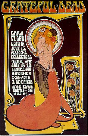
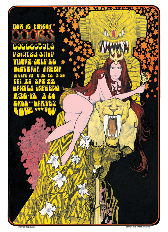
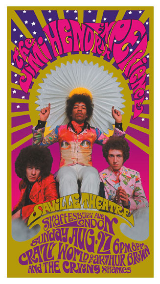
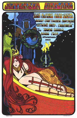
I've always heard the term art nouveau but I never knew exactly what it was. I remember liking the art but if you would have asked me for an artist or an example I honestly wouldn't remember. When looking through the images in Chapter 11 I started to recognize the style and thought of the 1960s and their crazy colorful concerts posters. Very similar to art nouveau they carried the same style yet used a little more color. They had women figures as the main focus with some crazy typefaces to go along with the image.
Art nouveau had a revival in the 1960s when artists started to draw inspiration for concert posters. Some of the first posters created were seen in San Francisco in 1966 for psychedelic rock (Musée D'Orsay). Psychedelic rock was a style of music hat was influenced by psychedelic culture and used to enhance the experiences of psychedelic drugs. Notable musicians include the Beatles, Jimi Hendrix, Grateful Dead, Jefferson Airplane and Cream to name a few. Concert promoter, Bill Graham, commissioned artists to create posters for his events and was influential in the musical renaissance of the 1960s in San Francisco.  "These psychedelic graphic designers (Hapshash and the Coloured Coat group, Wes Wilson, Victor Moscoso, etc), with dazzling bravura, introduced everything that Art Nouveau had invented into the domain of signs and images, and appropriated certain themes like hair, the peacock, the androgynous figure or, in contrast, highly sexual figures," (Musée D'Orsay). Posters and album covers were becoming a popular medium for this expression and the use of psychedelic drugs enhanced the visuals (Musée D'Orsay). This blend of art and text reflected the changing times of art. Like Jugend, the artists were allowed to create their own typeface, in this case they just chose what typeface they wanted, that would match their illustration. Their typefaces did try to mimic the movement of sound waves from rock and roll concerts in their illustrations typefont. Music posters would soon lose ground to television and radio.


Famous Art Nouveau artist Alphonse Mucha's 1896 ad for Job cigarettes (left) was used to to promote a 1966 rock concert (right) by Alton Kelly and Stanley Mouse.

A famous artist from this era was Bob Masse.

Grateful Dead 1967

The Doors 1967

The Jimi Hendrix Experience 1967 with photographer Karl Ferris

Jefferson Airplane 1967


Sources:


Image sources:

Tuesday, October 21, 2014

Module #4

Reading Assignment: Chapters 9 & 10

The Industrial Revolution and the Arts & Crafts Movement


During this week's assignment I became really fascinated by Eadweard Muybridge's sequence photography. I remember flipping through the book for the first assignment and putting a post-it note on that page because I liked it so much. The different variations in the photos reminded me of one of my favorite books as a child, a flip book. I absolutely loved these books! I would always try to get my hands on one and play with it for hours. I loved the ones that had two sequences so that you just had to flip the book the other way to play the second set of images. I don't know what it was about those sequences but they made me so curious. Obviously they worked seamlessly but I could never really wrap my head around them. I would sit there for hours studying each page and each image and find the slight differences only to be dumbstruck every time I flipped through them. I must have thought there was a special secret to it or it was magical in some way but it got me every time. I knew that together they made this cool animated video in my hands but seeing them separately as solo images on printed paper made it seem impossible. 

Eadweard Muybridge (1830-1904) and his famous horse in motion photographs

Flip books were originally introduced as folioscopes (flip book in french) by the Frenchman Pierre-Hubert Desvignes in the 1860s (Fouché). Flip books gave the illusion of movement in sequence without the use of a machine. Desvignes is credited as the inventor of the flip book but John Barned Linnett was the first to patent the idea of a flip book. Linnett, English lithograph printer, patented the flip book under the name "The Kineograph" in March 1868 (Fouché). Flip books started becoming very popular at the end of the 19th century and into the beginning of the 20th century. In 1894, Herman Casler invented the Mutoscope, a machine that aligned images in sequence to create a moving picture. A mutoscope was essentially a flip book in a machine. Mutoscopes were considered the first machine that applied the simple principle of persistency of vision studied by Muybridge and Etienne-Jules Marey (Fouché). Mutoscopes became very popular in the U.S. for their success at "Penny Arcades" (Fouché). People would insert coins into the machine and turn the handle to watch the different sequences play out in animated form. Thus began the animation and birth of cinema.

An advertisement for the Mutoscope

The first GIF, graphics interchange format, was created by Compuserve in 1987 (Alfonso III). This new image format was able to use color and replaced the run-length encoding format (RLE) which only ran black and white photos. What made the GIF so special was it's compressed format that allowed faster transfer times across slow modem connections. The original version, 87a, was created by Steve Wilhite. The following year a new version was released that allowed people to create compressed animations using timed delays (Alfonso III). Wilhite credits the success of GIFs to Netscape. 

"What has made GIF hang around is the animation loop that Netscape added. If Netscape had not added GIF in their browse, GIF would have died in 1998," -Wilhite (Alfonso III).

Some of the first GIFs I remember are the rotating Earth one, the American flag in the wind and the dancing baby. Remember that baby in a diaper that rotates in a full circle like it's doing a Native American chant? Yes, that one. Seems a little creepy now but at the moment I enjoyed it. These early GIFs were always on loops and didn't have the best quality. They were usually on white backgrounds and were very basic. Now the modern versions are usually loops of videos from movies or TV like cats getting scared into boxes or creative ones like time lapses of children growing up. The New Yorker recently used a GIF as their cover for the first time last month. GIFs are so accessible now that you can download apps that will make them for you.

Early GIF of a rotating Earth

Muybridge GIF

Overall, I think Muybridge's idea was amazing! That crazy bet for $25,000 really paved the way for sequence photography and GIFs. I love how you can trace GIFs back to something like sequence photos from Muybridge. The direct connection might now be there but the horse in motion photos did lead to other ideas that eventually led to animations like GIFs that run on loops and look like virtual flip books to me. Now I'm looking at GIFs on a daily basis! It's also funny to think that as a child the internet was soooooo slow. I hated dial-up internet and connecting to the internet took forever! It's also crazy to think that internet is just as old as I am. I grew up in an internet world and yet 20 years later it has rapidly changed and there are generations being born into this normalcy of smartphones and being forever connected. I also finally learned how to pronounce GIF! While doing my research I learned that the developers used the Jif peanut butter slogan as a parody for GIF. So next time you think of how to pronounce it just think of peanut butter and you'll be correct. Also found a cool article that turned Muybridge's photos in GIFs. Click here if you'd like to check out the Buzzfeed article.


Sources:


Image Sources:


Tuesday, October 14, 2014

Module #3

Reading assignment: Chapters 5-8

It's crazy to think that the Declaration of Independence was printed using Caslon font. Such a significant piece of U.S. history and it can be traced back to Benjamin Franklin and its European roots. It never really occurred to me how books or even the font we use in everyday writing got to this point in time. In order to write this blog post there were people creating these fonts and letters in wood blocks or metal at some point. It was printed on paper and then transferred to books in mass production. Then somewhere along the line it was transferred to the internet for everyone to use.

Declaration of Independence

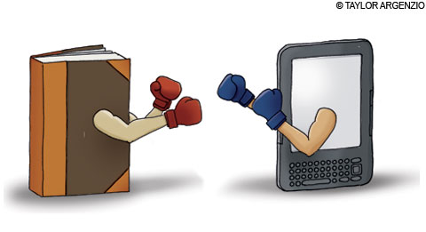
Back then block printing was just getting started and books were rare and only for the rich. Most early books were of religious significance too. Now, eBooks are the next big thing. Yes, an electronic book is the latest version. Books were only available in paperback and now they are available online to download in minutes! Incredible! Imagine telling a scribe that one day he could download an entire books in minutes. Don't forget to mention babies are reading on iPads too. Completely insane and unheard of. The only big difference would be the internet. We would still be carrying around printed books just like the Italians in the Renaissance. Ours would be more modern but essentially they are the same thing. Now you can find people reading Kindles on airplanes. Don't forget audio books too! The Kindle is still so odd to me. How can you sit there and read a digital book? Don't your eyes hurt after a couple of hours? I already have glasses and reading a printed books hurts my eyes after a couple hours. Yet Amazon keeps coming out with new versions of the Kindle and it seems moderately popular in the U.S. My favorite part about this is not the current technology but the path it came to get here. Literacy was a small privilege in the 1300s saved only for scribes and priests. While they eventually lost their power to printing literacy still managed to rise and continues rising. The only people left who are illiterate mostly remain in third world countries that lack the money and technology or people who can't afford to get an education.

Books vs. Kindles

I went to a presentation at UC Berkeley yesterday and one of the professors was talking about books and how 10% of all books in use right now were published in 2012. That's ridiculous! Of all the books in circulation around the world 10% were made in 2012. I also looked up the statistic to double check. The rough estimate for the current number of books in the world is 210 million. The last official number was 129,864,880 million in 2010 (Skipworth). Google actually counted all the books in the world and created an algorithm to do so. Here's the link for the Google books blog. In 2012 the estimated total of books printed were 2.2 million so yes it's a little more than 10%. I couldn't find a credible source for these numbers though. I do believe these books are getting printed in high volumes. A couple million sounds about right. Whoever said print was dead was clearly mistaken. And yes I googled that too. Apparently it was said in Ghostbusters (1984). As a product of the 90s I should know this but I have no desire to watch the movie. Nor do I believe the actual quote is from a fictionalized movie. 

Front page of the NYT in 1912

Overall, I am amazed how far books have come. From woodblock printing to paperbacks to eBooks and kindles. Crazy stuff and the last part has only happened thanks to the internet! Oh internet you managed to change everything in such a little bit of time and you'll never stop. I never imagined getting electronic books as a kid. The idea almost seems as ridiculous as the idea of flying cars (still waiting for that to happen). There's just something about them that I can't handle. Maybe it's because I can't physically see them. HA! As a journalist I love print. I love newspapers. I love reading paperback books but I also love reading all my news online on my iPhone. It's a twist of modern world with old school methods. I've always enjoyed the fact that books and newspapers are portable but now eBooks and mobile phones can do it too so there's no excuse. Until then I'll keep waiting with a newspaper in hand for what the internet revolutionizes next.

Small side note
If you've ever wanted to purchase a new or used book I would recommend BetterWorldBooks.com. I'm not promoting them out of profit or monetary gain but for the work they do. They donate books and help raise money for literacy funding and libraries. Amazing if you ask me but it's all for a good cause!


Sources:
Skipworth, Hunter. "Google Counts Total Number of Books in the World." The Telegraph. Telegraph Media Group, 6 Aug. 2010. Web. 14 Oct. 2014. <http://www.telegraph.co.uk/technology/google/7930273/Google-counts-total-number-of-books-in-the-world.html>.

Image sources:
Declaration of Independence
Book vs Kindle
2nd Book/Kindle image
NYT front page

Tuesday, October 7, 2014

Module #2

Reading assignment: Chapters 1-4

I absolutely loved Chapter 3: The Asian Contribution. There's always so much history when it comes to China. They created paper, they built the Great Wall and they invented fireworks! All American children should thank the Chinese for endless sparklers and lighting things on fire. The Chinese may be the world's first pyromaniacs, just kidding. But jokes aside the Chinese were always about new innovations and changing the world. Yet the most creative aspect in my opinion is their calligraphy. It's so intricate and beautiful! I can only imagine people spending countless hours dreaming of all the different ways you could draw or create a new character. With over 44,000 characters it's hard to believe that skilled calligraphers knew them all.

One of my favorite parts about calligraphy is the beauty in the strokes. They look effortless. There's so much precision yet it almost looks like a lazy person was just making things up. I love that in the early stages of chinese writing the characters are pictographic. Just like the early cave paintings these inscriptions are simple sketches created to tell a story. You can spot out a couple that look like stick figure people. I liked the idea that calligraphy was more personal and used feelings to tell a story. Looking at the photos of all the early examples of Chinese writing I tended to go towards the pictographs. It might just be the child in me but the images are easy to relate to since they have the child like quality. You can imagine children drawing these images because they don't know how to spell yet so they use images to explain themselves. Compared to later examples of Chinese writing the characters are not as easy to read and if you don't read Chinese then they're just strokes of ink.

Example of chin-wen inscriptions

I was able to connect my learning to the 2008 Beijing Summer Olympics. The logo for the Olympics has a calligraphic feel with its pictographic image. The image is a person or a stick figure to makes things simple. They use block printing techniques to make it look like a chop was used for imprinting the image. The font selection looks like modern calligraphy with it's clean strokes but also making it readable. The font has the stroke appearance and looks like a real calligraphy pen was used to write it. For the posters below the logo you can see in the background the simple image mimicking the body of the athlete. They're essentially pictographs of the sport. The one in the middle is doing martial arts and the pictograph behind them is also doing a high kick motion. In my opinion it looks like a modern take on ancient Chinese writing with modern images.


Posters from the 2008 Beijing Olympics


Overall the techniques used for ancient Chinese writing are relevant today. All these ancient pictographs are used in modern texting. Take emoticons/emojis for example. They use images as symbols of different emotions to tell a story. Instead of writing about your emotion you can just pick a face that explains how you feel. Even simple tasks like texting can be attributed to the earliest form of writing. I feel really appreciative of the innovations from the Chinese. The more I read and learn about the origins of graphic design and writing the more I notice things. Little things like paper don't seem so simple anymore.

Image sources:
Chin-wen inscription
2008 Beijing Olympics logo
2008 Beijing Olympics posters

Sunday, September 28, 2014

Module #1

The reading assignment for Module 1 is to look at every picture in the book. After doing this, reflect on your initial thoughts and observations.


This book was massive when I got it in the mail! Reminded me of the art history class I took and the huge book I had to carry around. I'm assuming all art textbooks will be quite large as well. Flipping through the pages and looking at all the images was fun. I was a little worried in the beginning because I didn't recognize anything. The hieroglyphics were standard. I loved The Horse in Motion (1883) on page 160. The sequence photography really captured my attention. I also just love the motion to it. I did recognize some art nouveau pieces. Like in any history book my attention gets drawn to war propaganda, especially the Nazi Party. I have quite the fascination with Nazi Propaganda. Yes I'm a horrible person for being fascinated by Nazis but they're just so interesting I can't help myself! I also try to imagine how these words and posters persuaded people into thinking genocide was a good idea. Overall, I enjoyed the textbook and thought it was very well put together.

To be honest I don't think I knew what graphic design really was. Yes I've heard it before a million times but I didn't know the definition and what it was all about. I just imagined graphic designers as people who work on designing and creating websites. I always connected graphic designers to the internet and online design but after my first week of graphic design classes my views have changed dramatically.

As a journalist I know all about visuals and how infographics can add to your story or just be your entire story. I'm a sucker for infographics too. I can read articles and look at infographics all day. I even was the art director for our magazine class and I kinda loved it. I've always considered myself an artistic person. My father has always influenced us with art as young children. My father absolutely adores Salvador Dali and he has a couple prints lying around the house. I use to look at them for hours as a kid and try to find as many scenes as I could. Even sometimes creating a story to go along with it. When my sister was studying abroad we even went to Italy and visited all the museums. Even had the chance to go to Rome and visit the Vatican and the ultra beautiful Sistine Chapel. Easily one of the most beautiful things I have ever laid my eyes on. Yet never made the connection between the art and graphic design.

Never thought as photography as graphic design either. All those clever marketing campaigns and logos? All graphic design. Packaging at supermarkets and department stores? All graphic design. The countless items that I bought because the packaging was cute and my favorite color? Graphic design. All those times I've spent $50+ at Mac Cosmetics because their packaging was so cute I couldn't pass it up? Graphic design once again. I was so naive to what it really was. And yes the textbook showed different forms of art but they all have graphic design aspects. I also feel a little dumb while writing this because how could I have not noticed all along! Everything in front of your eyes is graphic design. From the street signs to the movie posters to the covers of books and magazines. All of it! I could call this my graphic design awakening. And no I'm not trying to be an over achiever and just write anything to get an A. I am being completely honest. I'm really happy with my decision to take some graphic design classes. You can never have too many degrees and while I'm applying to grad school for journalism I do plan on continuing with graphic design. Possible career choice? Definitely maybe.